Companies
Leaves. And Collaborating.

By Sue Dayton
UX/Product/Visual Designer
June 13, 2018 — Santa Cruz, CA
A weekend creating something cool in AR with friends.
May 22 6:30 PM
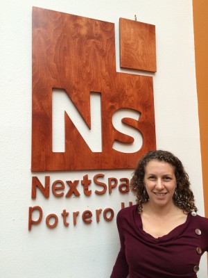
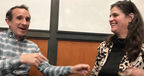
It all started with Spence Lindsay (Lindsay Digital), Chris Miller (Cloud Brigade and Launch Brigade) and I grabbing a drink at a local restaurant & bar called Reds. We work out of NextSpace Santa Cruz, a fabulous collaborative coworking community. I’d collaborated with Chris in 2015 designing the UX for Bicycle Blue Book’s new marketplace, but hadn’t had the chance to work with my friend Spence. Tech Raising 2018, a local hackathon weekend was approaching, and Spence had an idea. As we discussed the inspiration for it, our enthusiasm grew. By the time we parted ways an hour later, we’d formed a team, including David Fierstein and Mike Muldoon, and had a rough plan to build an iOS Augmented Reality (AR) app with Unity and Placenote on the front end and a AWS framework for the serverless backend.
My experience in AR? Zilch. Zero. Nada. But… I love figuring stuff out. I love learning. And I love the collaboration of designer and developers. I am a UX design geek. So I downloaded and tested a few AR apps, researched Unity and Placenote, and readied myself for a 48 hour adventure.
Day 1: Friday, June 1 6 PM – MIDNIGHT
48 hours to deliver a Minimum Viable Product (MVP) and pitch to the judges and fellow hackathon participants. Our team met up around 6pm and grabbed a space to work in. After the Tech Raising opening introductions and initial idea pitches (and any requests for team members), our team got to work.
We were all iterating various functions all at once. I use a Chrome extension, MindMup to plan out the user flows, map flows of websites, etc. It’s a collaborative tool, and free. This came in very hand for a hackathon. It enabled me to share a live mapping of the user flows and modify as we discussed backend, frontend, and interactions based on our original concept. This was a living, breathing doc up through the end of the weekend, and let us plan out the features for the MVP, stretch goals, and full features for the app. By the end of the evening, we had a pretty good idea of the ideal experiences of both user roles – sender and recipient.
Day 2: Saturday, June 2 8:30 AM – MIDNIGHT
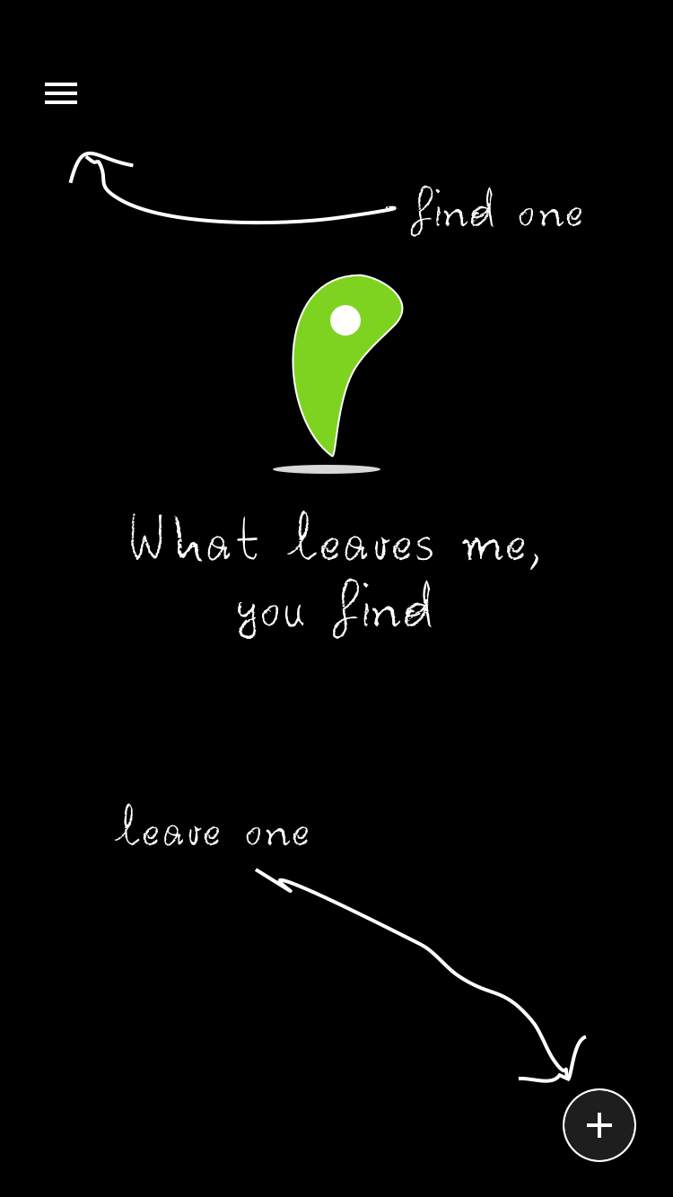
Our Unity developers, David and Mike worked on building the core functionality; Spence researched and designed the particle system tool for the 3D drawing in space, Chris worked on setting up the serverless backend structure in Amazon Web Services (AWS), and I got started on the UX/UI product design. Much like designing a UI for a voice-controlled app, I wanted the focus to be on the drawing. So the UI needed to stay out of the way as much as possible. Complexity made simple, but intuitive.
Continue reading article here: https://www.linkedin.com/pulse/leaves-collaborating-susan-dayton/
###
Tagged NextSpace, Sue Dayton, TechRaising


